I used to follow a blog called ‘The Staging Yard’, following a UK based modeller’s trials at building a US layout, until it went quiet in 2014. Reading RMWeb the other day, I saw that the blog had reappeared and was being continued on RMWeb, written by a certain Dr Gerbil-Fritters. I thought my alias was strange…..
Nevertheless, this thread makes interesting reading, as the layout gets progressively simpler, as can be seen from these plans.
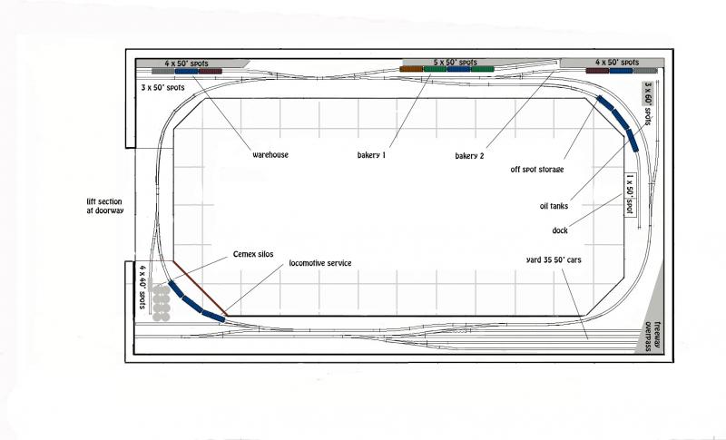
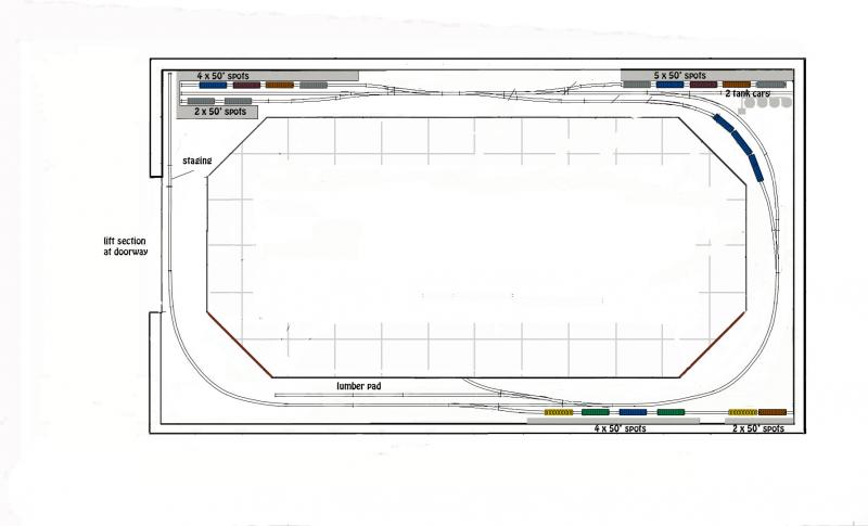
The thought is that the simpler plans are just more realistic and can be operated prototypically.
However, at the end of the thread, we have the worrying comments….
Not sure yet. The pike worked fine, was reasonably authentic, yet I just didn’t have any love for it. I am still looking for an emotional connection, but it’s proving elusive.
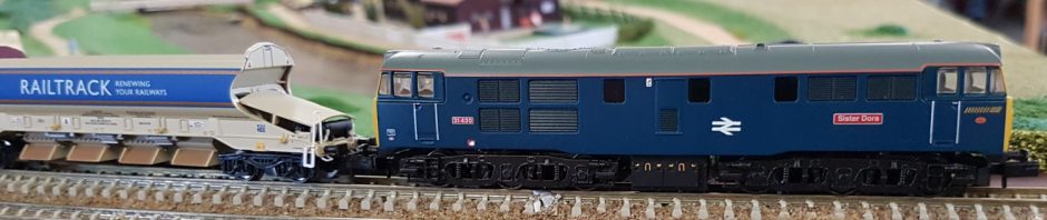
And after a little play with British ‘OO’ and ‘O’….
I’m having a short sabbatical from model trains.
Sometimes its difficult to decide what you really want to model. I hope he will soon be back, but I can so identify with that!
The second example of ‘less is more’ is in ‘O’ gauge, and is on the Model Railroad Hobbyist site. Here ‘Kurt’ describes his new switching layout, Cleveland Flats. A mere 11′ long in ‘O’ gauge, plus a few feet headshunt on the left. This little layout is based on the big cereal food processor at Cleveland Flats. And even in ‘O’ gauge, it is close to scale length. The plan is closely based on the prototype, with short tracks and tight clearances.

Another excellent little switching layout that could built in any scale – in ‘N’ perhaps a 6′ x 6″shelf would take the whole plan and give a lot of entertainment for its size. Imagine the care needed when crossing both grade crossings.

I was aware of the first layout you mentioned and had been following it on RMWeb. As the design evolved and was further refined I kept overhearing myself remark, to myself, on how elegant a plan it was. Not just minimalism in terms of design but how well it looked when being operated based on what I could see in his photos – every one just looked right. I’m sorry to read that he may be stalled now. That’s really too bad.
I wasn’t aware of the latter layout you mentioned (Cleveland Flats) and have just finished reading through that thread. What a fantastic layout and testimony to both the scale and what can be done with the right inspiration. You’re right in that it could be easily done in a smaller scale in a smaller space but I wonder if part of the magic is the way that, in O, the shear size of the layout distracts from its simplicity? Regardless, what a fantastic layout and a thread I’ll return to again to see how it progresses. I sure like this one.
Cheers
/chris
LikeLike